I kind of fell off the blog bandwagon at the end of 2018...but it's a new year and I'm going to try to be more diligent about posting here. I do post a lot on my Karen K. Creates Facebook page, Instagram, and Stamp Nation...but I've neglected posting all those cards here as well. I'm going to do my best to change that this year!
Recently, I ordered some new postage stamps since the rates are going to go up again soon. I found two sets of stamps that I thought were really cute for cards that I send out to friends and family. The first set is the newest LOVE stamp. I really like the colors and the font of the word LOVE. The second set I couldn't resist because not only are the colors great, but believe it or not, the stamps are scratch 'n sniff stamps!! They take me back to the days when I collected stickers and had many pages of scratch 'n sniff stickers!!
On this first card, I chose Catherine Pooler inks that closely matched the four colors on the postage stamp. The colors I used were Grape Crush, Limoncello, Rockin' Red, and Party Dress. I knew that I probably had many different heart shaped stamps to choose from in my stash, but I happened to have a newer stamp set, also from Catherine Pooler, sitting on my craft desk...so I tried it out. Using the 4" Gina K Wreath Builder stencil in my MISTI, I went to work! It looked a little empty when I was done, so I added the smaller hearts to fill in some of the blank spaces. The LOVE sentiment was a word die from a Stamp of Approval set from early in 2018. I wanted the sentiment to be red and match the red stamped hearts, so I took my Rockin' Red ink pad and swiped it on some white card stock. I find this is the best way to have coordinating card stock with these inks! I used a Postage Stamp die to cut out the panel and adhere it to a card base. Again, I used the ink pad directly on the card to make a red border around the panel.
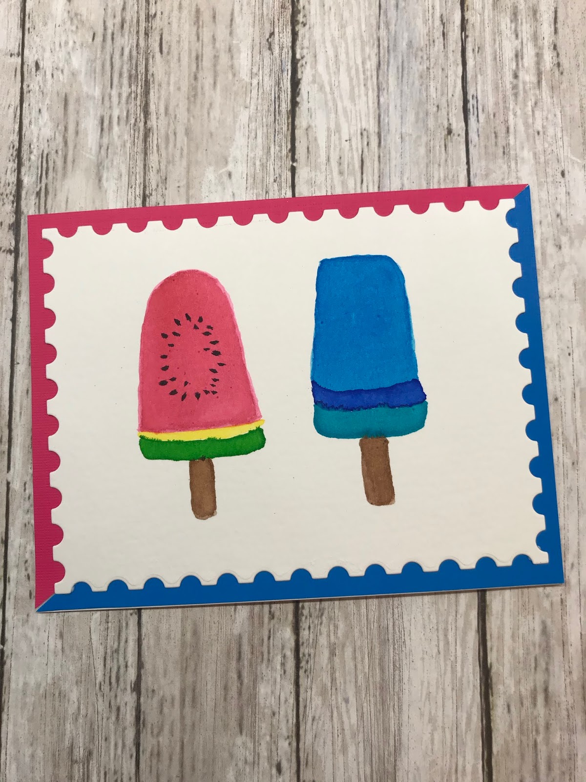
The second set of postage stamps I purchased were the Frozen Treats stamps...all very colorful popsicles! Since I don't have any popsicle stamps, I thought a good way to replicate the images would be to water color them. Now, I'm certainly no water color expert, but I thought the shapes of the popsicles would be fairly easy to replicate. Again, I used Catherine Pooler inks (these inks are so versatile!!). The Postage Stamp die came in handy for this panel as well. I wanted to mat the panel on some colored card stock that matched, but couldn't decide between the pink or blue. So, I cut a triangle of each color and adhered them down behind the panel. I just love all the bright colors on both of these postage stamp sets.
I think this just goes to show that inspiration is everywhere we look! Now I have matching postage stamps to send out these cards to loved ones!!
Welcome to my cozy corner of the internet! I intend to use this blog for sharing my creativity from the craft room to the kitchen and everything in between. Enjoy!
Showing posts with label card making. Show all posts
Saturday, January 19, 2019
Saturday, October 13, 2018
World Card Making Day inspiration - Day One
Recently, card makers around the globe celebrated World Card Making Day on the first Saturday of October. The paid membership site I belong to, Stamp Nation, celebrates this holiday every year, but instead of on just one day, they make it a weekend long event! This year, their Creative Team members posted a favorite place around the world that they have either lived or visited. Each post had a collage of their photos from their travels. It also included what the flag looks like from that particular place. These photos and flags served as inspiration for other members to make cards based off of the original post. There were eight posts over the course of the weekend and playing along with the challenges was so much fun! I thought you might enjoy seeing the cards I created for these challenges.
DAY ONE: England
The first post was by the owner/founder of Stamp Nation, Catherine Pooler. She and her husband visited England earlier in the year. She posted lots of photos of her travels. There were pictures of Big Ben, Buckingham Palace, lots of architecture, and flowers. Having visited England myself, I so enjoyed seeing her pictures of her trip. The picture that I used as inspiration was of a chalkboard sign that was on the sidewalk in front of a store. The phrase on the sign said "Do more of what makes you happy." It had some nice flowers drawn around the phrase and I thought the message itself was inspirational! Here is the photo I used as inspiration:
Sometimes, when I used "mood boards" for inspiration, it's hard for me to NOT create a literal replication of what I see in the pictures...it was sort of the case here. Below is my take on this sign. I found an inspirational sentiment among my stamp sets and knew that I had to recreate the chalkboard look. I white heat embossed the sentiment onto black card stock. I have lots of flower die cuts in my stash, so it was just a matter of finding the right sized ones to cut out of some cheery colors. It may be hard to tell from the inspiration sign, but the name of the store looks like it is a gold color...so I used some baker's twine that had some gold in it to tie at the top of my card. I felt this was a pretty literal take on the inspiration, but it got me started on my World Card Making Day weekend of fun!
DAY ONE: Hungary
There was a second post on day one and this time, the place of inspiration was the country of Hungary. I have never been to Hungary, but the photos were still inspiring! This post was by Kelly Martin, a member of Stamp Nation's creative team. Most of her photos were of the beautiful, old architecture of that region. But what I was inspired by, was the Hungarian flag as seen here. It seems like a pretty simple thing to be inspired by, but that's what caught my eye in her photo collage!
I have used a technique once or twice in the past that I knew I wanted to try out with this flag as my inspiration. I took a rectangular acrylic block and applied some red ink to one edge and green ink to the opposite edge. I took my water spritzer and sprayed some water onto the block. This made the ink sort of pool up on the block. I then quickly turned the block upside down and pressed it into the middle of a piece of watercolor card stock and held it there for a minute or so while the water and ink absorbed into the paper. The tricky part was lifting the block straight up so as not to mix the wet ink too much. I had a paper towel on standby to blot up any extra pools of ink that may have run together. After that dried, I stamped a globe from the new Catherine Pooler Amber's World stamp set. I used Versamark ink to stamp it and then applied WOW Embossing Powder in Rose Gold. After I heat set it, I was done! I didn't feel like I needed to add any more embellishments to the card except for mounting it onto a card base. I really like how this one turned out and after posting it on the Stamp Nation site, I received many compliments and some members even used MY card for their inspiration! Here's a look at my finished card:
I will post day two and three later. Day two had four challenges: Portugal, Hawaii, Canada, and Italy. Look for more posts coming soon! Thanks for stopping by!
DAY ONE: England
The first post was by the owner/founder of Stamp Nation, Catherine Pooler. She and her husband visited England earlier in the year. She posted lots of photos of her travels. There were pictures of Big Ben, Buckingham Palace, lots of architecture, and flowers. Having visited England myself, I so enjoyed seeing her pictures of her trip. The picture that I used as inspiration was of a chalkboard sign that was on the sidewalk in front of a store. The phrase on the sign said "Do more of what makes you happy." It had some nice flowers drawn around the phrase and I thought the message itself was inspirational! Here is the photo I used as inspiration:
Sometimes, when I used "mood boards" for inspiration, it's hard for me to NOT create a literal replication of what I see in the pictures...it was sort of the case here. Below is my take on this sign. I found an inspirational sentiment among my stamp sets and knew that I had to recreate the chalkboard look. I white heat embossed the sentiment onto black card stock. I have lots of flower die cuts in my stash, so it was just a matter of finding the right sized ones to cut out of some cheery colors. It may be hard to tell from the inspiration sign, but the name of the store looks like it is a gold color...so I used some baker's twine that had some gold in it to tie at the top of my card. I felt this was a pretty literal take on the inspiration, but it got me started on my World Card Making Day weekend of fun!
DAY ONE: Hungary
There was a second post on day one and this time, the place of inspiration was the country of Hungary. I have never been to Hungary, but the photos were still inspiring! This post was by Kelly Martin, a member of Stamp Nation's creative team. Most of her photos were of the beautiful, old architecture of that region. But what I was inspired by, was the Hungarian flag as seen here. It seems like a pretty simple thing to be inspired by, but that's what caught my eye in her photo collage!
I have used a technique once or twice in the past that I knew I wanted to try out with this flag as my inspiration. I took a rectangular acrylic block and applied some red ink to one edge and green ink to the opposite edge. I took my water spritzer and sprayed some water onto the block. This made the ink sort of pool up on the block. I then quickly turned the block upside down and pressed it into the middle of a piece of watercolor card stock and held it there for a minute or so while the water and ink absorbed into the paper. The tricky part was lifting the block straight up so as not to mix the wet ink too much. I had a paper towel on standby to blot up any extra pools of ink that may have run together. After that dried, I stamped a globe from the new Catherine Pooler Amber's World stamp set. I used Versamark ink to stamp it and then applied WOW Embossing Powder in Rose Gold. After I heat set it, I was done! I didn't feel like I needed to add any more embellishments to the card except for mounting it onto a card base. I really like how this one turned out and after posting it on the Stamp Nation site, I received many compliments and some members even used MY card for their inspiration! Here's a look at my finished card:
I will post day two and three later. Day two had four challenges: Portugal, Hawaii, Canada, and Italy. Look for more posts coming soon! Thanks for stopping by!
Saturday, August 25, 2018
Stretching background stamps
I don't know about you, but I love geometric designs. I suppose it's because, to me, they look all neat and orderly....and that's my thing! Another thing I think draws me to geometric patterns is that they are mostly symmetrical...and again, that's my thing! Recently, Catherine Pooler came out with a new release which included a background stamp called Angled Squares. Here's a picture of the full stamp.
While I love the geometric pattern, it's slightly offset from the center. What am I to do with this non-symmetrical design? I have no problem using it as is, but I wanted to see how I could create something that WAS symmetrical. So, off I went to my craft table to brainstorm!
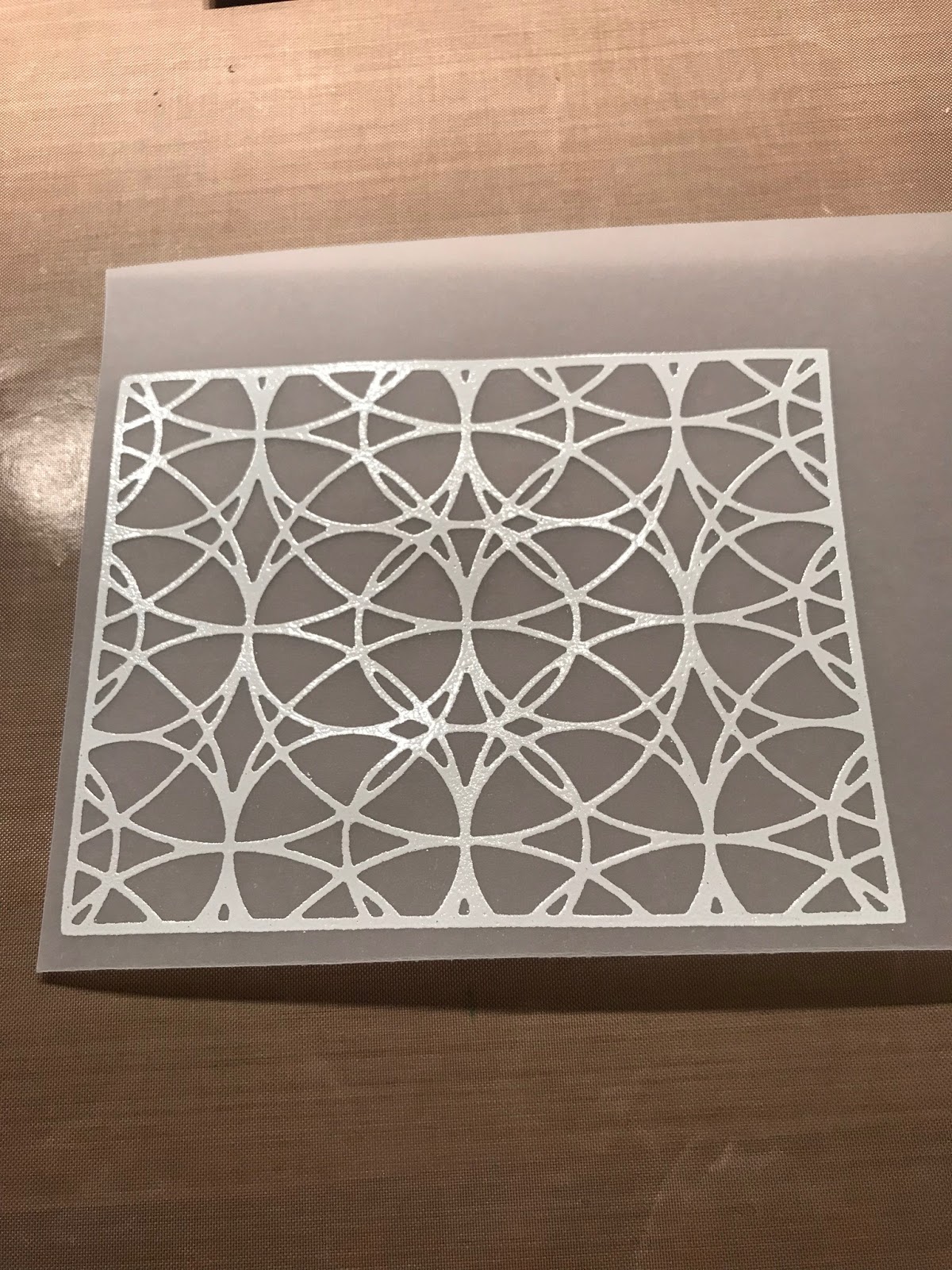
What I ended up doing was stamping only the square portion of the stamp onto vellum with Versamark ink three times. I then used rose gold embossing powder from WOW! embossing and heat set it. After cutting the three squares out, I arranged them onto a black card stock panel. Since they overlapped, I ended up cutting away the portions that were behind the middle square. I have yet to decide if I want to add anything else to the card...maybe a sentiment strip or a word cut die. I think as it is in the pictures below, it's kind of striking without anything added...what do you think?
I really like how the rose gold embossing powder looks on the vellum. It reminds me of the art deco era.
While I love the geometric pattern, it's slightly offset from the center. What am I to do with this non-symmetrical design? I have no problem using it as is, but I wanted to see how I could create something that WAS symmetrical. So, off I went to my craft table to brainstorm!
What I ended up doing was stamping only the square portion of the stamp onto vellum with Versamark ink three times. I then used rose gold embossing powder from WOW! embossing and heat set it. After cutting the three squares out, I arranged them onto a black card stock panel. Since they overlapped, I ended up cutting away the portions that were behind the middle square. I have yet to decide if I want to add anything else to the card...maybe a sentiment strip or a word cut die. I think as it is in the pictures below, it's kind of striking without anything added...what do you think?
I really like how the rose gold embossing powder looks on the vellum. It reminds me of the art deco era.
Thanks for stopping by!
Saturday, June 30, 2018
One card, two looks
Have you ever created a card and wondered what it would look like if you made it again, but just changed the colors? Recently, I was inspired by a blog post by Catherine Pooler where she did just that...so I thought I'd give it a try.
I love using Catherine Pooler inks for stamping. There are so many color choices and the saturation and vibrancy of the colors are amazing. Currently, she has four different collections of ink under two categories...Life of the Party as well as the Spa Collection. As you can imagine from the names, Life of the Party ink colors are very colorful and bright while the Spa inks are more muted tones. Even the names of the ink colors relate to the collection themes!
My cards below were made with four colors from each ink collection. The first card used colors from the Life of the Party collection. I used Tiki Torch, Lime Rickey, Aquatini, and Pixie Dust. I used the direct to paper method with the Pixie Dust ink pad to add color to a panel to create the purple frame for the backdrop to the card. In both examples, I used the Catherine Pooler stamp set called Say it in Diamonds.
On my second card I chose four colors from the Spa Collection that were similar to the inks from the first card. I think the Spa inks lend themselves wonderfully to use for masculine themed cards. I used the colors Sauna, Eucalyptus, Daydream, and Royal Treatment. Again, I used the purple ink, Royal Treatment, direct to the paper to create the frame for the card panel.
I hope this inspires you to create something two different ways!
I love using Catherine Pooler inks for stamping. There are so many color choices and the saturation and vibrancy of the colors are amazing. Currently, she has four different collections of ink under two categories...Life of the Party as well as the Spa Collection. As you can imagine from the names, Life of the Party ink colors are very colorful and bright while the Spa inks are more muted tones. Even the names of the ink colors relate to the collection themes!
My cards below were made with four colors from each ink collection. The first card used colors from the Life of the Party collection. I used Tiki Torch, Lime Rickey, Aquatini, and Pixie Dust. I used the direct to paper method with the Pixie Dust ink pad to add color to a panel to create the purple frame for the backdrop to the card. In both examples, I used the Catherine Pooler stamp set called Say it in Diamonds.
On my second card I chose four colors from the Spa Collection that were similar to the inks from the first card. I think the Spa inks lend themselves wonderfully to use for masculine themed cards. I used the colors Sauna, Eucalyptus, Daydream, and Royal Treatment. Again, I used the purple ink, Royal Treatment, direct to the paper to create the frame for the card panel.
I hope this inspires you to create something two different ways!
Saturday, June 23, 2018
Challenge Inspiration
It's been a while since my last blog post...busy busy busy life!
There's a challenge going on right now over at Stamp Nation. It's called Tag You're It! Basically, someone posts a card and if you're inspired by it, you tag yourself in and then CASE that card. CASE stands for Copy And Share Everything. Sometimes, when I'm lacking in the inspiration department, I'll use a card that someone else has posted as the inspiration and CASE it!
The following card was posted from Catherine Pooler. I decided to use three things from her card to come up with my own design. I used the same three colors, repetitive sentiment, and black and white patterned paper.
This is the inspiration card:
Since I pretty much only use Catherine Pooler inks, using the same three colors was an easy choice. I took each ink pad and colored directly on white paper to create my own colored card stock. Then I used a STAR die cut word and cut it four times into black card stock. I also cut the STAR word into the colored card stock I made and used the inlay die cut method to put it in the black card stock. Doing this was also using the repetitive sentiment inspiration from Catherine's card. Finally I added a strip of black and white patterned paper to the bottom and embossed a white sentiment on the card and it was complete!
This challenge was fun and a good way to be inspired by others!
There's a challenge going on right now over at Stamp Nation. It's called Tag You're It! Basically, someone posts a card and if you're inspired by it, you tag yourself in and then CASE that card. CASE stands for Copy And Share Everything. Sometimes, when I'm lacking in the inspiration department, I'll use a card that someone else has posted as the inspiration and CASE it!
The following card was posted from Catherine Pooler. I decided to use three things from her card to come up with my own design. I used the same three colors, repetitive sentiment, and black and white patterned paper.
This is the inspiration card:
Since I pretty much only use Catherine Pooler inks, using the same three colors was an easy choice. I took each ink pad and colored directly on white paper to create my own colored card stock. Then I used a STAR die cut word and cut it four times into black card stock. I also cut the STAR word into the colored card stock I made and used the inlay die cut method to put it in the black card stock. Doing this was also using the repetitive sentiment inspiration from Catherine's card. Finally I added a strip of black and white patterned paper to the bottom and embossed a white sentiment on the card and it was complete!
This challenge was fun and a good way to be inspired by others!
Saturday, March 31, 2018
Cover plate die as a stamp
I recently purchased my first cover plate die from a Catherine Pooler release. It's a beautiful stained glass die. This cover plate die is pretty when used as intended, but I wanted to see if I could turn it into a stamp! I've watched some You Tube videos on how crafters take their die cuts and make stamps out of them, and I thought, how hard can it be?! So I tried out the technique.
First I used the cover plate die to cut white fun foam, instead of card stock. After removing all the pieces from the cuts, I glued the fun foam to a piece of white card stock and backed it with a thin piece of chipboard to give it some stability.
I put some temporary adhesive on the back side of the chipboard so that I could adhere it to the door of my MISTI. I then inked up my new "stamp" with Versamark ink and stamped it onto some new vellum from Catherine Pooler. After stamping it a few times to be sure it was all good and inked, I used some white embossing powder and covered the vellum. After heating up the embossing powder, I had the below...I was so excited that it worked as a stamp!
I then took a rainbow of colors from my Zig Clean Color Real Brush Markers and started coloring the image from the BACK side. This allowed me to go over the lines and not have to worry about it! You can see the back side view is kind of messy looking.
Once I was finished coloring, I turned it over and cut it down to fit the front of a card panel. I didn't want to add any sentiments to it as I didn't want to cover up any of the beautiful stained glass look of it. The panel was a little time consuming, but it was a lot of fun trying a new technique by turning this cover plate die into a stamp. And who doesn't like to do some coloring from time to time!?!
First I used the cover plate die to cut white fun foam, instead of card stock. After removing all the pieces from the cuts, I glued the fun foam to a piece of white card stock and backed it with a thin piece of chipboard to give it some stability.
I put some temporary adhesive on the back side of the chipboard so that I could adhere it to the door of my MISTI. I then inked up my new "stamp" with Versamark ink and stamped it onto some new vellum from Catherine Pooler. After stamping it a few times to be sure it was all good and inked, I used some white embossing powder and covered the vellum. After heating up the embossing powder, I had the below...I was so excited that it worked as a stamp!
I then took a rainbow of colors from my Zig Clean Color Real Brush Markers and started coloring the image from the BACK side. This allowed me to go over the lines and not have to worry about it! You can see the back side view is kind of messy looking.
Once I was finished coloring, I turned it over and cut it down to fit the front of a card panel. I didn't want to add any sentiments to it as I didn't want to cover up any of the beautiful stained glass look of it. The panel was a little time consuming, but it was a lot of fun trying a new technique by turning this cover plate die into a stamp. And who doesn't like to do some coloring from time to time!?!
Friday, March 30, 2018
Thank you stencil card
In the latest Catherine Pooler release there was a stencil designed by Shawna Clingerman. It was called the Square Dance Stencil. It's pictured below in it's original form.
When I stared at this stencil for what seemed like forever and tried to decide how best to use it, my eyes were drawn to the patterns within the design. Sometimes this is easy to do depending on the design. Whether she knows it or not, my mother, who is a quilter, taught me to see patterns within intended designs. So in THIS particular stencil, I envisioned a rainbow pattern. I used Distress Oxide inks to sponge on the color as I meticulously masked off areas of the stencil so each color had its own distinct place.
I added a black die cut thanks, adhered it to a black panel and then to a white card base. It's a 4 1/4" square card, smaller than the typical A2 size I normally make, but it packs a punch! Enjoy!
When I stared at this stencil for what seemed like forever and tried to decide how best to use it, my eyes were drawn to the patterns within the design. Sometimes this is easy to do depending on the design. Whether she knows it or not, my mother, who is a quilter, taught me to see patterns within intended designs. So in THIS particular stencil, I envisioned a rainbow pattern. I used Distress Oxide inks to sponge on the color as I meticulously masked off areas of the stencil so each color had its own distinct place.
I added a black die cut thanks, adhered it to a black panel and then to a white card base. It's a 4 1/4" square card, smaller than the typical A2 size I normally make, but it packs a punch! Enjoy!
Saturday, March 24, 2018
Welcome to my blog!
I took the plunge and started a blog! It's been simmering in my mind for a while now and I've finally decided to just sit down and do it! As my header says, my blog will have a variety of posts ranging from my creations from my craft room to the kitchen and anything in between.
One of my hobbies includes card making. I consider myself an amateur card maker and take a lot of inspiration from following other card makers on Instagram and You Tube. I've learned many techniques and styles over the past few years from these fellow card makers. And now I want to share my creations with all of you! If you'd like to see my Instagram page, you can find me at karenkcreates.
The latest card from my craft table is pictured below. It was a post on Stamp Nation for a CASE (copy and share everything) challenge. I hope you like it!
One of my hobbies includes card making. I consider myself an amateur card maker and take a lot of inspiration from following other card makers on Instagram and You Tube. I've learned many techniques and styles over the past few years from these fellow card makers. And now I want to share my creations with all of you! If you'd like to see my Instagram page, you can find me at karenkcreates.
The latest card from my craft table is pictured below. It was a post on Stamp Nation for a CASE (copy and share everything) challenge. I hope you like it!
Subscribe to:
Posts (Atom)